Thursday, November 25, 2010
Sony Bloggie Viral Advert Idea
Here is my idea for the new Sony Bloggie video recorder viral advert. I have used an image of the Bloggie and put it into four different scenarios. The first has the Bloggie recording a bungee jump, the second recording the journey in a hot air balloon, then the Bloggie is skiing and finally he is on a Roller Coaster. I thought that these are all fun and extreme activities that would be interessting to film from point of view of someone actually doing them.
Friday, November 19, 2010
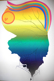
Wing Of A Bee (digital)
This is the second half of the Wing Of A Bee project, the digital version. I did this using Illustrator and it was my first time using the software. I am happy with this outcome, I like how the colours blend nicely into each other, but if I was to change anything then I would make sure the cobweb was more visable on the wing. The colours stand out which look nice but my analogue version has more pastel shades so they aren't quite the same as each other.
Thursday, November 18, 2010
Wing of a Bee (analogue)
Our brief was to design a full colour A2 butterfly wing. There weren't other instructions to this part of the brief, so the design could be of anything we wanted. My idea for this design was about the life of the butterfly. Butterflies only live very short lives so I represented this by having the top half of the wing in bright colours with beautiful things like the sun and the rainbow. The bottom half of the wing shows darker colours with a broken edge and a cobweb dangling from it. I used coloured pencils for my work as they are a very blendable material and the colours of the wing blend gently into each other, from light to dark. For the second half of the brief we are digitally reproducing this wing but flipped over so that it creates the other half of the butterfly.
Excuses
This is my piece of work in answer to the excuses brief. We had to think of some excuses as to why we didn't do our homework and then creatively express the excuse typographically. Here, I expressed my 'My work fell in the fire' excuse by cutting out the phrase by the indivudal letters so that I could set them alight. I wanted to burn them so that they were still legible, but only just. I used Franklin Gothic Heavy typeface because I wanted a solid letter form that would be easy to cut out and also to be easily read. I then put my burnt letters back together to make the phrase and took a photo of this. I used photoshop to add some flames that help express the excuse and it adds small flecks of colour. I am happy with my finished result, although I had another idea in mind that I think will work even better. I will artwork my new idea and add this to my blog at a later date.
Meet Me On The Corner
This work was a follow on brief from the previous brief that we were given. It asked us to visit 40 places around central London in 4 hours of one day. As we visited each place, we were either asked to collect a souvenir, take a photograph or make a drawing of it in our sketch books. We were then asked to make a visual map of our day on two A2 sheets of paper using everything that we collected. I like the mixture of photographs, drawings and raw materials used here that create a collage of my day. I particularly like my drawing of the pipe and the use of the plastic bag that I kept when I bought a postcard at the Royal Academy of Arts.
Thursday, November 4, 2010
Pay To Play
Brand Me Up Buttercup
Subscribe to:
Comments (Atom)


